Zürich, SwitzerlandThe rebranding of jobs.ch & jobup.ch
The challenge
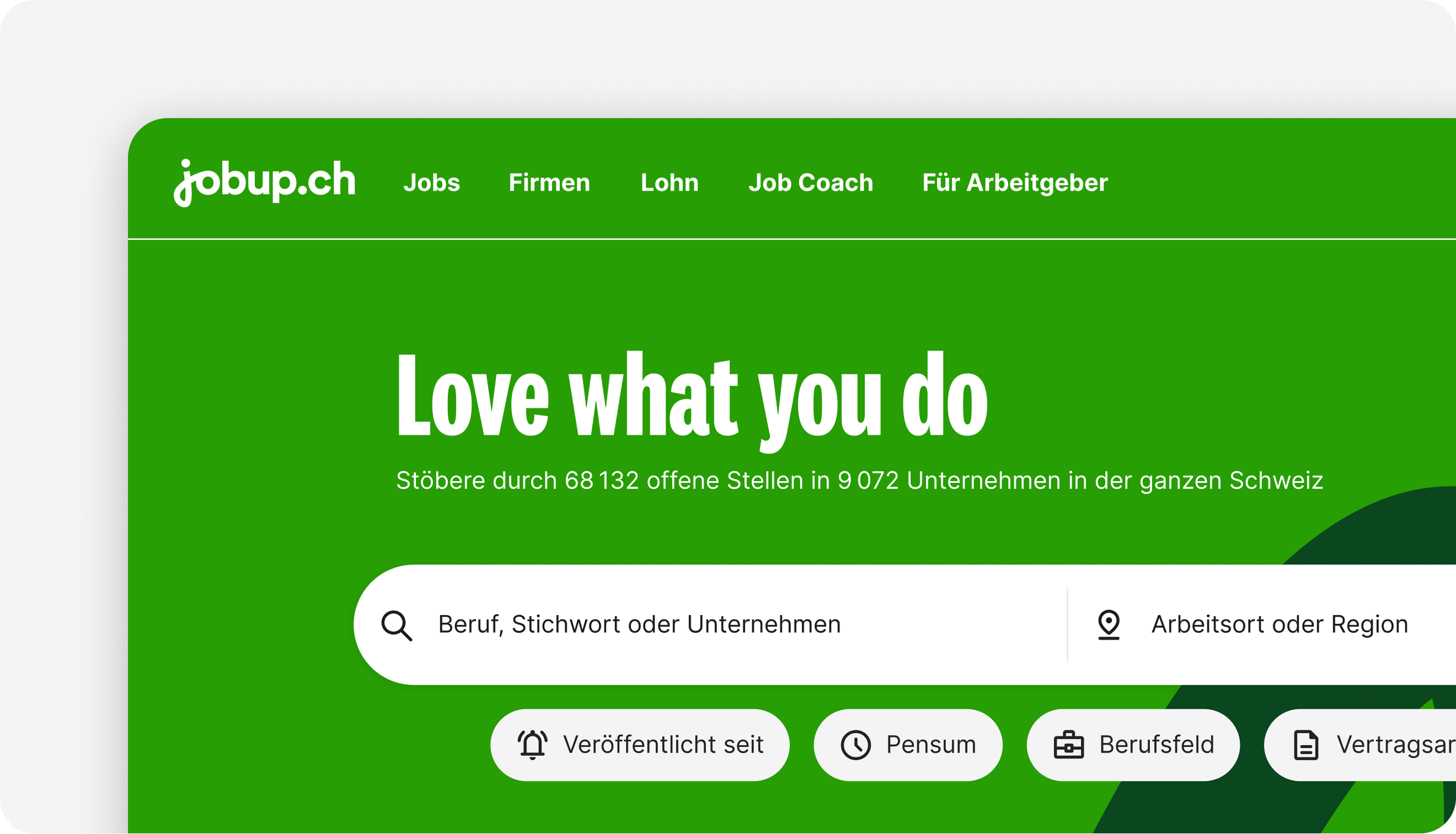
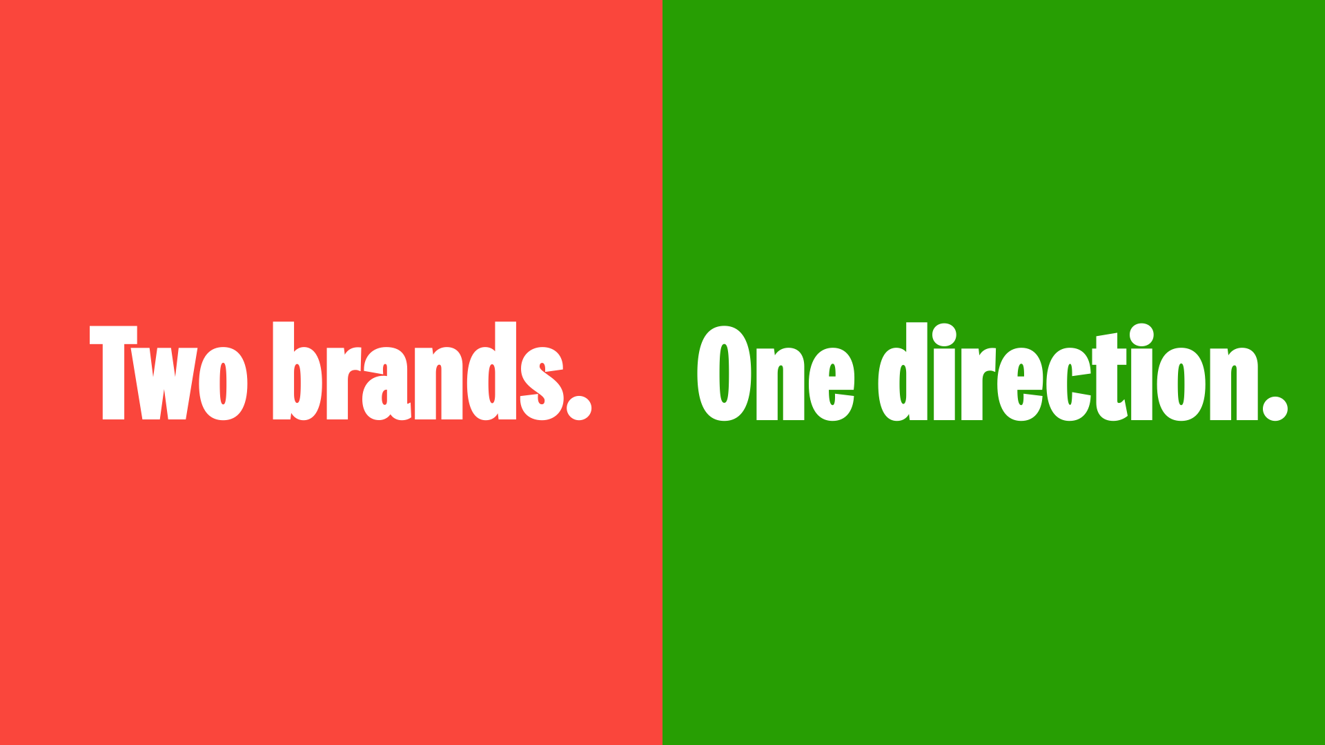
JobCloud AG operates Switzerland's leading digital job marketplace through two trusted consumer brands: jobs.ch (German-speaking Switzerland) and jobup.ch (Romandie). Both are market leaders, widely recognised and deeply embedded in the Swiss labour market.
The brief was a brand refresh. The real challenge was aligning narrative, teams, and markets at scale without triggering instability concerns.
Internal teams needed assurance that systems, processes, and workflows would remain unchanged. B2B clients needed confidence that platform functionality was stable and their job postings unaffected. Leadership needed smooth execution across six offices, five countries, and multiple languages. And regional teams needed to maintain their market identity while adopting a unified visual direction.
The strategic tension: introduce fresh energy to two established brands without eroding the trust that makes them market leaders.
The approach
Frame it as evolution, not disruption
The language mattered. This was positioned as a brand refresh, not a rebrand. Visual identity was changing. Everything else stayed the same. That distinction was critical to preventing internal panic and client concerns.
Messaging emphasised continuity: platform functionality unchanged, team structures intact, regional market positioning preserved. The refresh was about contemporary expression of existing brand values, not a departure from them.
Build internal momentum before external launch
The sequencing was deliberate. Internal adoption had to come first. A hybrid kick-off event for 400+ colleagues across five countries created shared understanding and excitement before any external communication began. This served multiple strategic functions: it tested the visual identity on the organisation's own teams, generated genuine enthusiasm that would carry into client conversations, and established a network of Brand Ambassadors who could support adoption across markets.
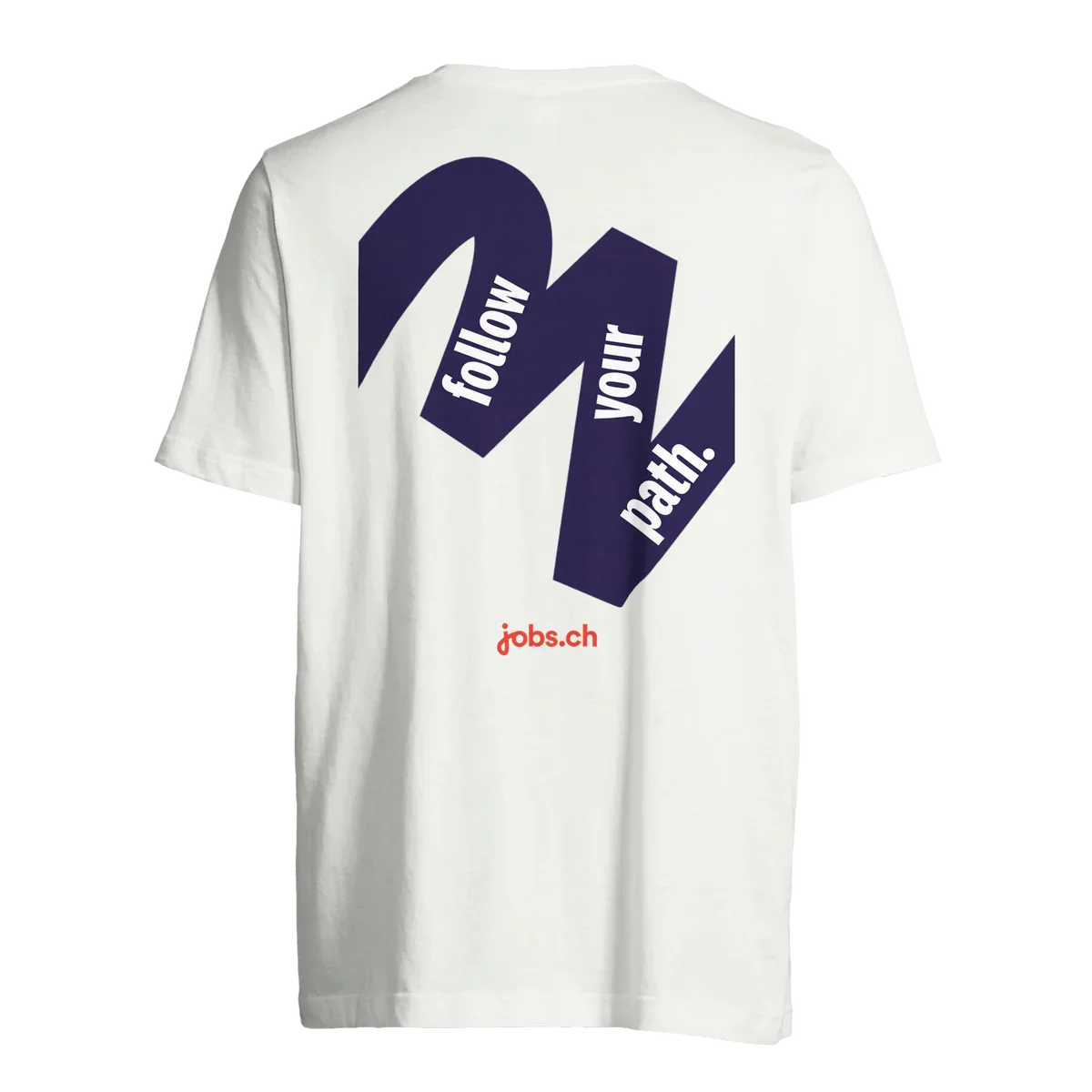
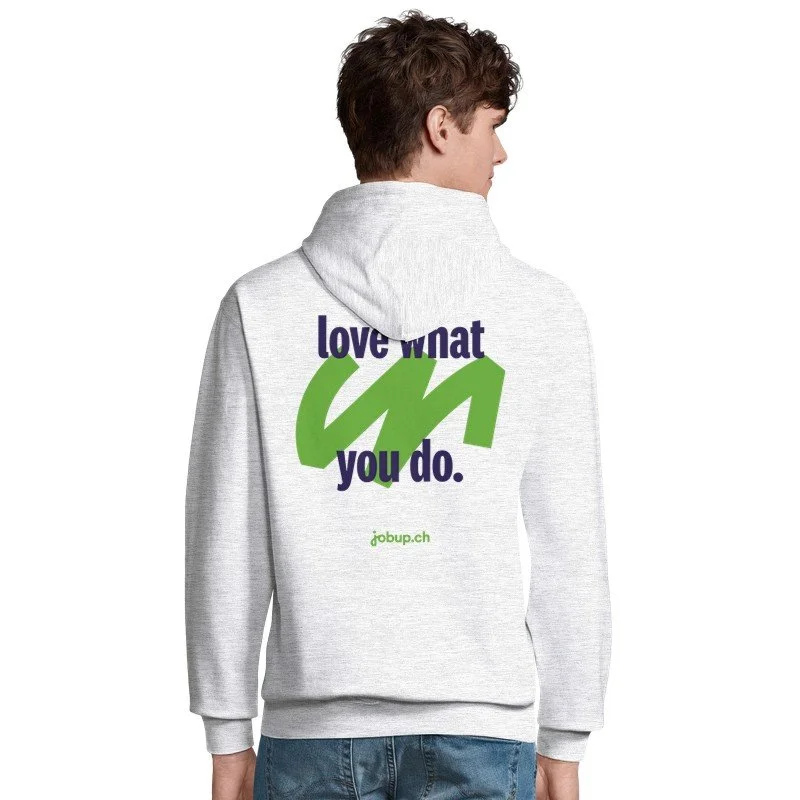
The brand video became a key narrative vehicle. I developed the script and recorded the English voiceover professionally, with French and German versions voiced by actors. This allowed the story to be told consistently across languages and markets. Launch assets (merchandise, materials, training) made the abstract identity tangible and reinforced adoption.
Address the "too bold" concern directly
Some internal voices worried the refresh might alienate conservative clients. Rather than softening the approach, the strategy was transparency: show the work early to internal teams, gather feedback, and demonstrate that bold visual identity could coexist with trusted platform stability. The internal launch served as proof of concept before external rollout.
Sales and Customer Service received tailored messaging and materials to handle client questions confidently. The core message remained consistent: the brands you trust, expressed with contemporary clarity.
Brand video English version scripted and voiced by Nick Praulins; French and German versions produced by Neu Creative Agency.
The outcome
The refresh launched on 1 February 2026 with clear, consistent messaging across internal, B2B, and B2C channels. Teams were confident, clients reassured, and the refreshed brands introduced without disruption to trust or operations. Press response has been positive, and adoption metrics are being tracked.
The project demonstrates how strategic communication can translate complex brand decisions into real-world adoption. When stakeholders span multiple countries, languages, and functions, clarity and sequencing matter as much as creative execution. The refresh worked because the narrative held under pressure across every touchpoint.